It is time to call the artists outside and tell them to make a new one. I am sorry im not skilled in this matter, thats why we (i say we, you and me, tag team, brothers til the end) must find some and make them bring a new logo for getbig.

The old ones aint really bad at all, but they were made back in the 90's, when you were living the dream ron.
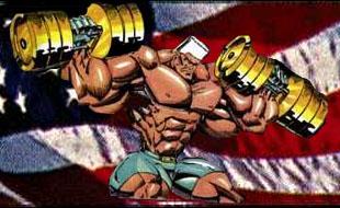
I think the new logo should keep the american flag in bg, the bodybuilder in the middle, and add the american eagle.
In the bottom, getbig should be written imitating the font, in green, or with the colors of the american flag.
Let me know what do you think ron