I love this chart as it shows that there really is no middle class in america and that all the wealth is gobbled up by the few rich persons/corporations that rule america. So for those screaming constantly about a middle class or that the president of american is attacking/hurting the middle class they can finally shut up and realize that in america there are only two classes...RICH and POOR and any fables about middle class are just that ...FABLES. Frightening reality indeed..
 Separate but unequal: Charts show growing rich-poor gap
By Zachary Roth
Wed Feb 23, 5:13 pm ET
The Great Recession and the slump that followed have triggered a jobs crisis that's been making headlines since before President Obama was in office, and that will likely be with us for years. But the American economy is also plagued by a less-noted, but just as serious, problem: Simply put, over the last 30 years, the gap between rich and poor has widened into a chasm.
Gradual developments like this don't typically lend themselves to news coverage. But Mother Jones magazine has crunched the data on inequality, and put together a group of stunning new charts. Taken together, they offer a dramatic visual illustration of who's doing well and who's doing badly in modern America.
Here are three samples:
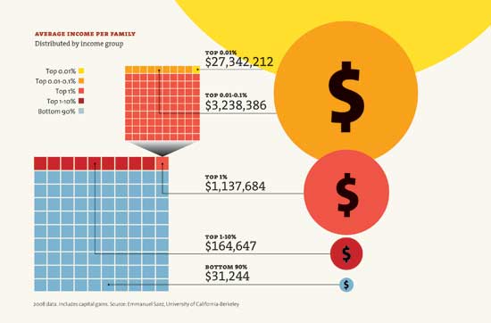
â¢Â This chart shows that the poorest 90 percent of Americans make an average of $31,244 a year, while the top 1 percent make over $1.1 million:
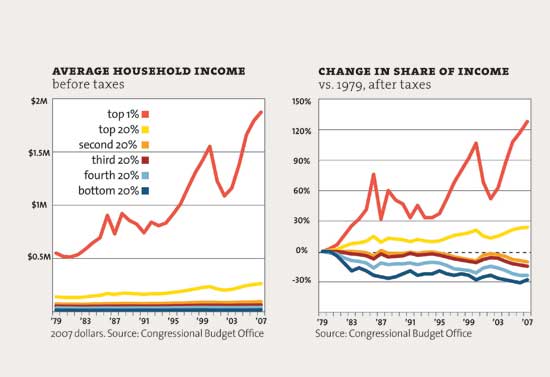
According to this chart, most income groups have barely grown richer since 1979. But the top 1 percent has seen its income nearly quadruple:
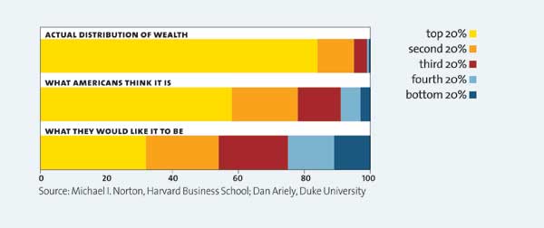
And this chart suggests most Americans have little idea of just how unequal income distribution is. And that they'd like things to be divvied up a lot more equitably:
To see the rest of these fascinating charts,
click on over to Mother Jones.
http://news.yahoo.com/s/yblog_thelookout/20110223/ts_yblog_thelookout/separate-but-unequal-charts-show-growing-rich-poor-gap