Thanks for the chart.
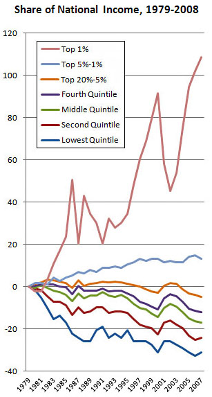
1. While the content of the chart is disconcerting, I don't think the divergences in income between quintiles (and the top 5%) would be as extreme if median real household income were used. The overall trend would still be present, but perhaps much less so.
2. As Thomas Sowell has pointed out, as far income goes, the statistical groups which usually serve as the units of analysis aren't simply groups of people: many people currently in the lower quintiles will end up in the upper quintiles, and vice versa. There is significant turnover among quintiles, meaning we shouldn't read into the chart that there is a class of "rich people" who have reaped the sole benefits of market moves while everyone else has suffered.
3. Also, this chart follows household rather than individual data. The size of households has been declining over the period under consideration, which naturally contributes to lower income-per-household values. But this can be consistent with per capita (per person) or median (individual) income increasing.
The changes in household size is a valid point and well taken, but it's the state of the demographics. I chose the chart because it was really the only one with separated populations, trying to find a per-capita chart is that's sorted by population segments is tough...but I think that chart shows enough data. I understand what Sowell is saying as well, but income disparity is the largest its ever been, or close to it and wages to budge. Every time we have a recession the "miracle cure" by the govt. and Fed Reserve seem to only help the top 5% or so. The cure the results in the bottom 90% doing worse than they were before.
I guess I'm just trying to say that there is a huge problem and the latest "Cure" by those in power is making the problem worse.
-Wage growth is stagnant/declining for the majority.
-Income disparity is massive.
-The top 5% or so are doing better than ever.
-The rest don't see any improvement.
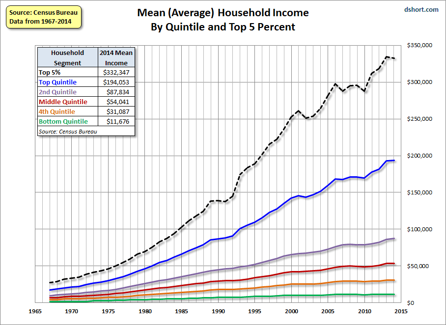
Here's a random chart:

Those income gains mirror the growth in the markets, not just now, but historically.
Yes, another mean household chart, but
Depressed wages: